End of day result with the hills. They don’t feel particularly outbacky but at least I know now that the haze colour wants to be grey-blue, not saturated blue.
End of day result with the hills. They don’t feel particularly outbacky but at least I know now that the haze colour wants to be grey-blue, not saturated blue.
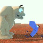
Here’s the heat shimmer in action. YouTube’s compression kills it pretty badly so watch it in HD. 🙂

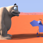
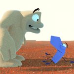
Here’s a heat shimmer effect worth showing off, the new version of Pointy pulling a face and a much brighter look than before thanks to a rough colour grade. I’m loving that blazing burnt orange which settles back to a hazy purple almost reminiscent of Maurice Noble. The desert’s still maybe too barren and flat but I’m liking this a lot.
I’m not sure about the rest of you but I feel like this composite could be an actual still frame from an actual CG animated film. Not some lush Pixar film obviously, something kind of low budget, but a legit actual film nonetheless. So it’s a total headspin to think it came out of me.
Now I see why Grant was encouraging me to take something to composite. The project is suddenly concrete in a way it wasn’t yesterday. That’s kind of awesome. 🙂
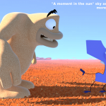
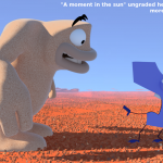
Edit: Added the ungraded version of the render and a comparison which shows both the graded and ungraded version in one image. This is why we grade things.
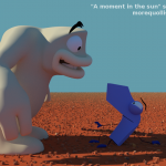
What do you think of the grade? Too bright? 🙂


More sky colour tests: blue, lemon, greenish and lavender. The sky I’m using to light is the usual blue in the first four pictures – the screen colour of the sky is added during composite along with light wrap.
The big picture uses one of Blender’s sky shaders and I’ve also turned depth of field on. This I like a lot. I’m pretty happy with the way the red of the desert turns purple as it gets closer to the horizon. Gronky’s inner silhouette is not great though. Ah well, it’ll come. 🙂
My god, it’s full of 16 to 22 February 2015.
This week was mainly spent focussed on look dev and trying to tighten up the script. In between that and getting sick, I did a ton of writing. Over twelve thousand words in first drafts – The Quiet One and other stuff. I don’t understand why but.. well.. it’s been that kind of week. My focus has not been the best. I blame coffee. Most people are OK with it, but for me it may as well be liquid ADHD.
Despite all this, “A moment in the sun” is still rolling along measurably from week to week. The intro and outro of the script have been chopped down. The Pointy model is no closer to being able to speak but rewrite by rewrite his dialogue is getting funnier. I’m back to setting up anticipations and making them pay off.
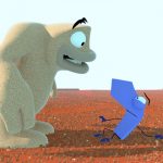
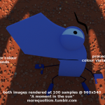
Look-wise I’ve predominantly been working with particle systems. (Are you sick of that shot with Pointy looking up at Gronky yet? I am, a bit.) The previously jagged rocks have been replaced with more crystal-shaped bevelled rocks instead. I tried putting patterns on the rock and they looked too visually busy. Even a slight bump map made it look too busy. For me the ground reads nicer with a bump map but there’s an observable difference in rendering speed as seen in the attached image. Is the ground more than 27% nicer with bumps? We shall see.
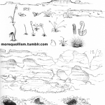
In the wee hours of Sunday morning I did a particle simulation test – explaining why would involve spoilers, as would discussing the cave in the concept art at the top of this post. I also did some rough atmosphere tests with a side shot. The landscape’s looking a bit too bare and Martian at this point. Better find some more stuff to put in it. 🙂